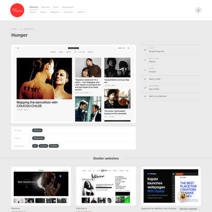
Info
A lot of what I've shown here emphasises user feedback and interaction, fluorishes that are important but ultimately shouldnt distract from the fact we are a website about writing.
I want the big ship to feel forward thinking and provocative. Lets add some grain and dirt to our designs and site
I'd also like Little Prayers to feature more prominently, maybe as a symbol next to the logo on the header (which I also agree, will work better a side-bar menU)
The new site should make space for these new emphases: Authors, Patreon, Live events/programmes, Our book, a note concerning copyright
This channel appears in